Transamerica
Customer Retirement Experience
As Lead Designer for our Customer Division, I helped our customers get on track for retirement through our digital initiatives. This case study illustrates how the UX process helped to put a product on track, satisfying both business objectives and the users’ needs.
Contributions
- User Research
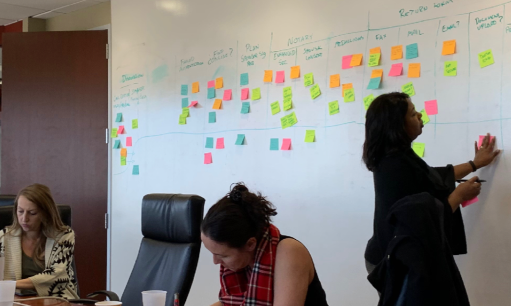
- Workshopping
- Strategy
- Concepting
- UX Design
- Systems Design
- UI Design
- Design Specs
- Progress Measurement
Modernizing an Aging Service
Upon joining the team, I found that an initiative already under way to modernize an aging customer experience. The scope revolved around the porting of all legacy transactions to a more modern platform. I was asked to develop a position on what that would mean for the user. There were artifacts from previous quantitative research available but more work would need to be done to develop a clear understanding of the landscape including identifying opportunities and risks.
Quantitative Analysis
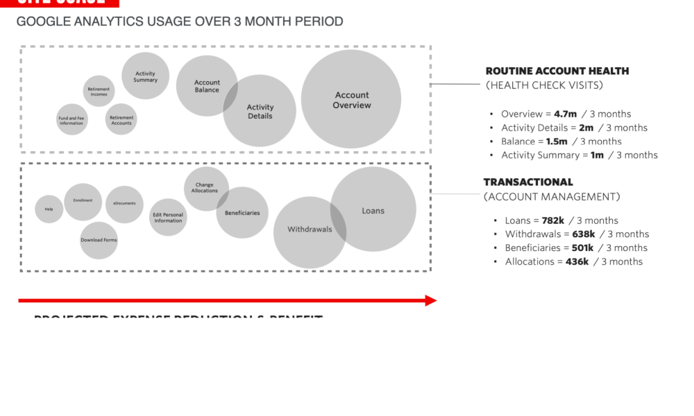
I dug in to analytics and call center data to identify some high level behavioral themes. The event and page usage data I was able to gather painted a picture of the types of interactions users were having online and helped identify some high level friction points. This would provide a rough guide to where I would need to focus when gathering insights. I also dug in to our call center and feedback tab data to better understand the types of issues our users were contacting us about. While some transactions bubbled up to the surface, login and registration stood out as a particularly painful experience.
Qualitative Research
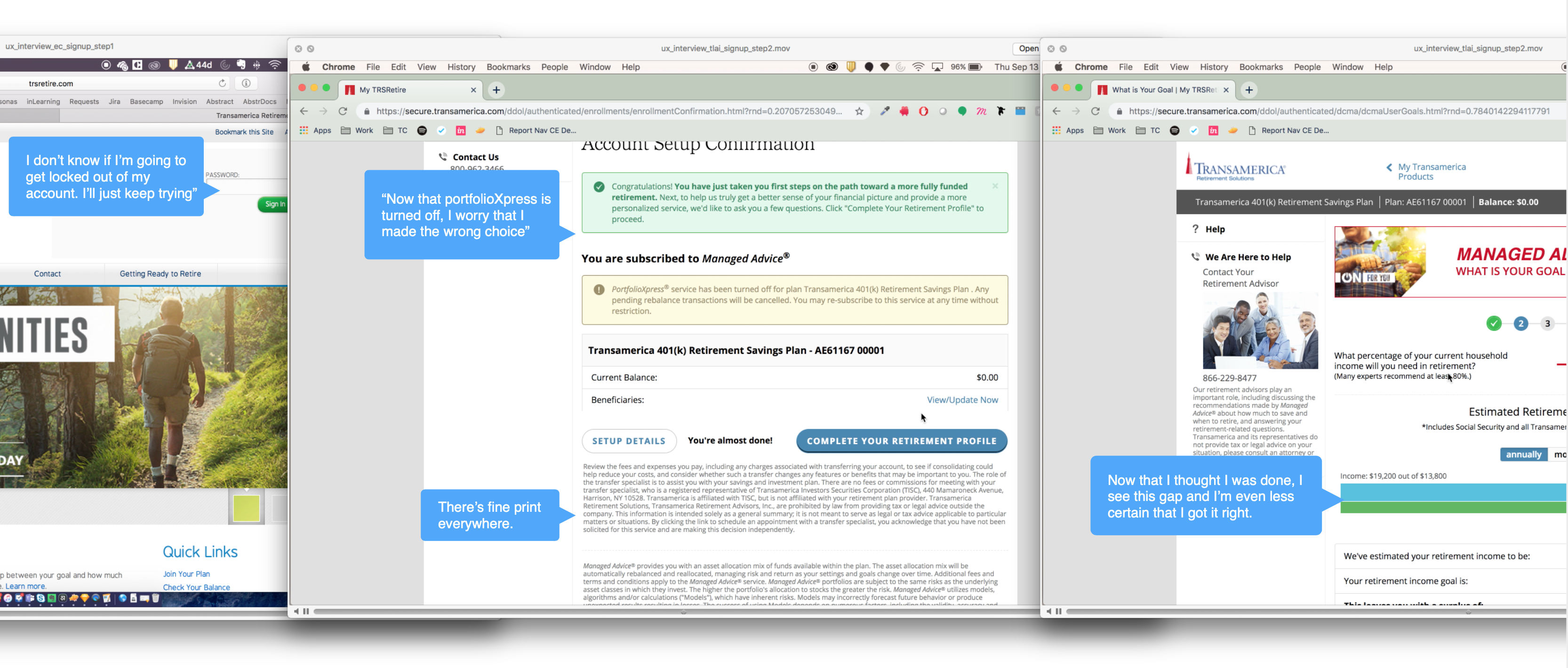
To quickly spin up some user interviews, I began recruiting internal and external plan participants to build empathy and start the learning process. I wrote a script intended to gather insights into their overall goals and motivations as well as at a transactional level including the signup, login, and enrollment experiences. I synthesized the results with the team and we were able to pinpoint where exactly users were struggling, understand their expectations and where our experience diverged, and answer some open questions about the analytics data.
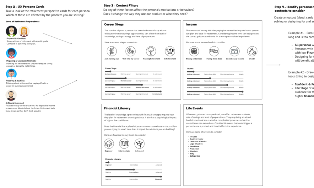
User Personas
I was able to assemble proto- user personas based on the research done to this point that I would continue to refine over following two years. These personas would be helpful in writing our epics and user stories, establishing our content strategy, prioritizing features, and identifying overlaps in behaviors and needs.
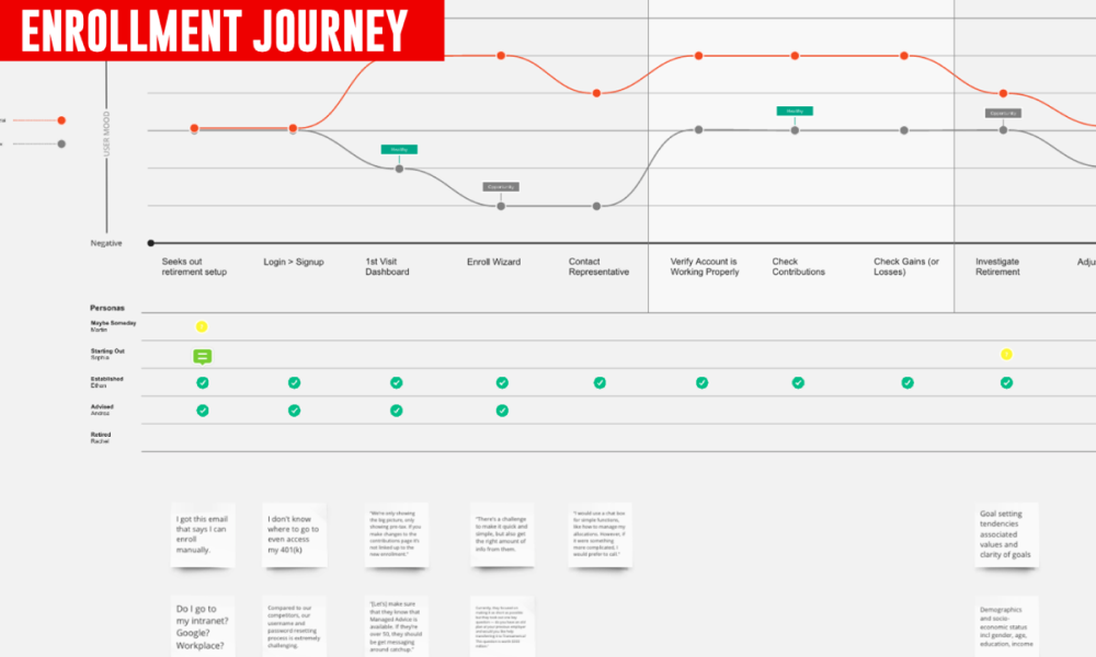
User Journeys
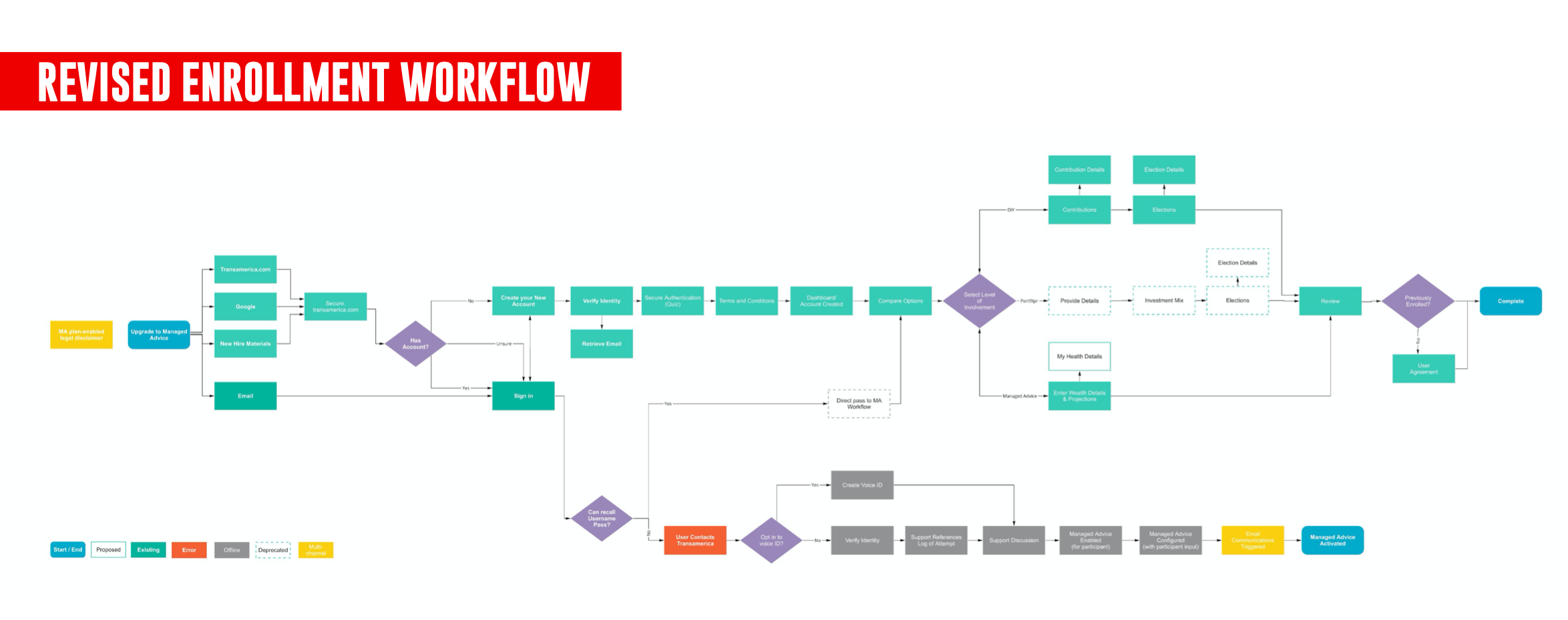
I then began mapping out our end to end user journeys to identify where there may be deltas in terms of friction and satisfaction at each leg of the digital experience. I also mapped out the complete user flow through the onboarding experience and flagged areas with the highest friction.
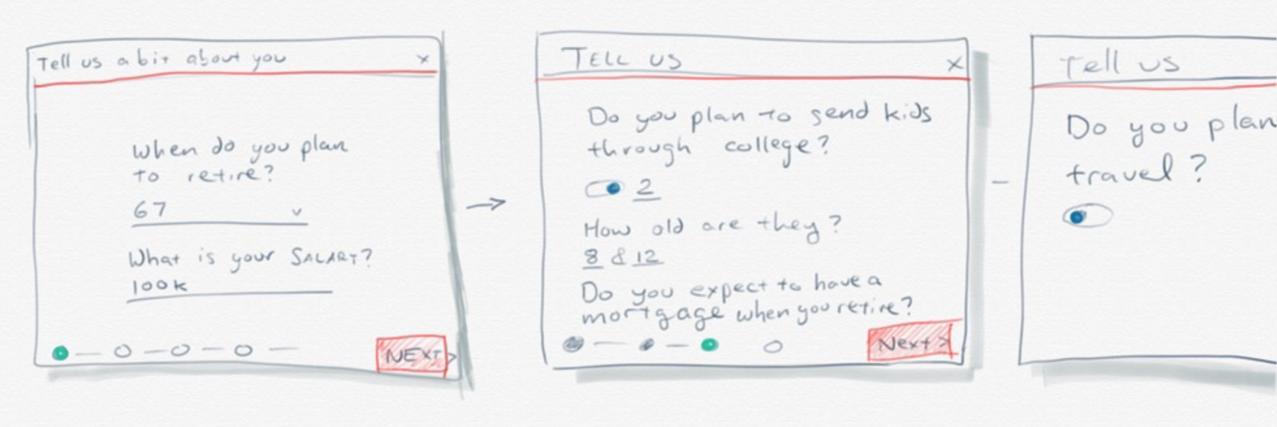
Low Fidelity Design
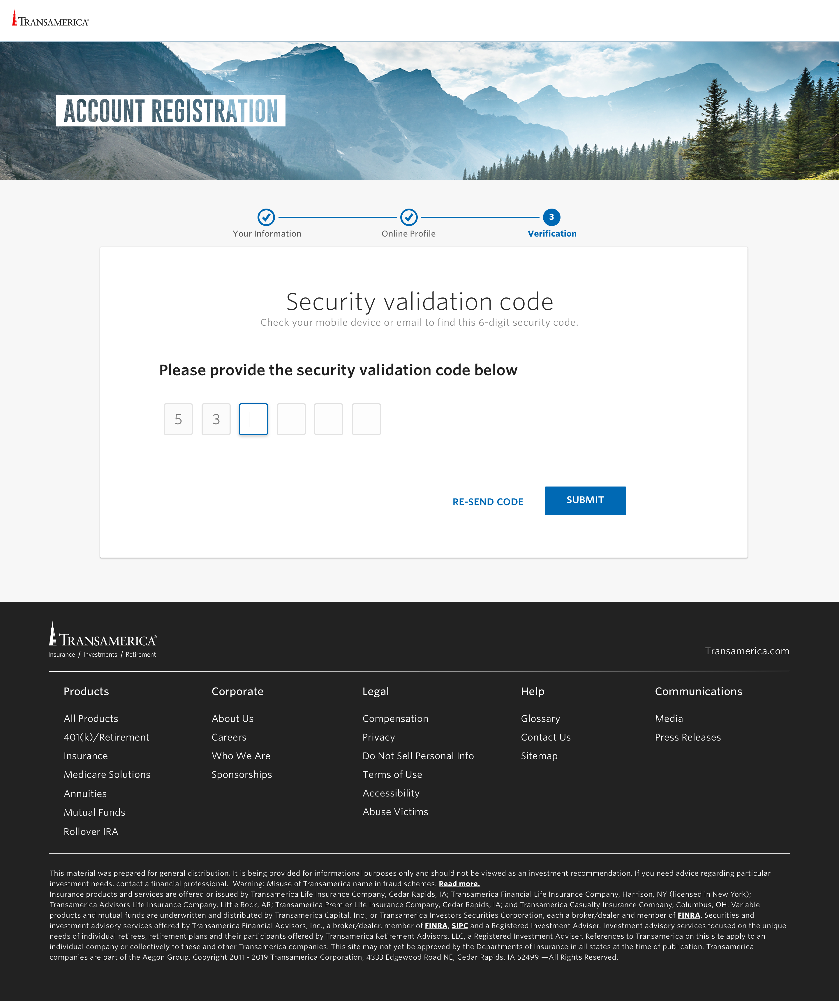
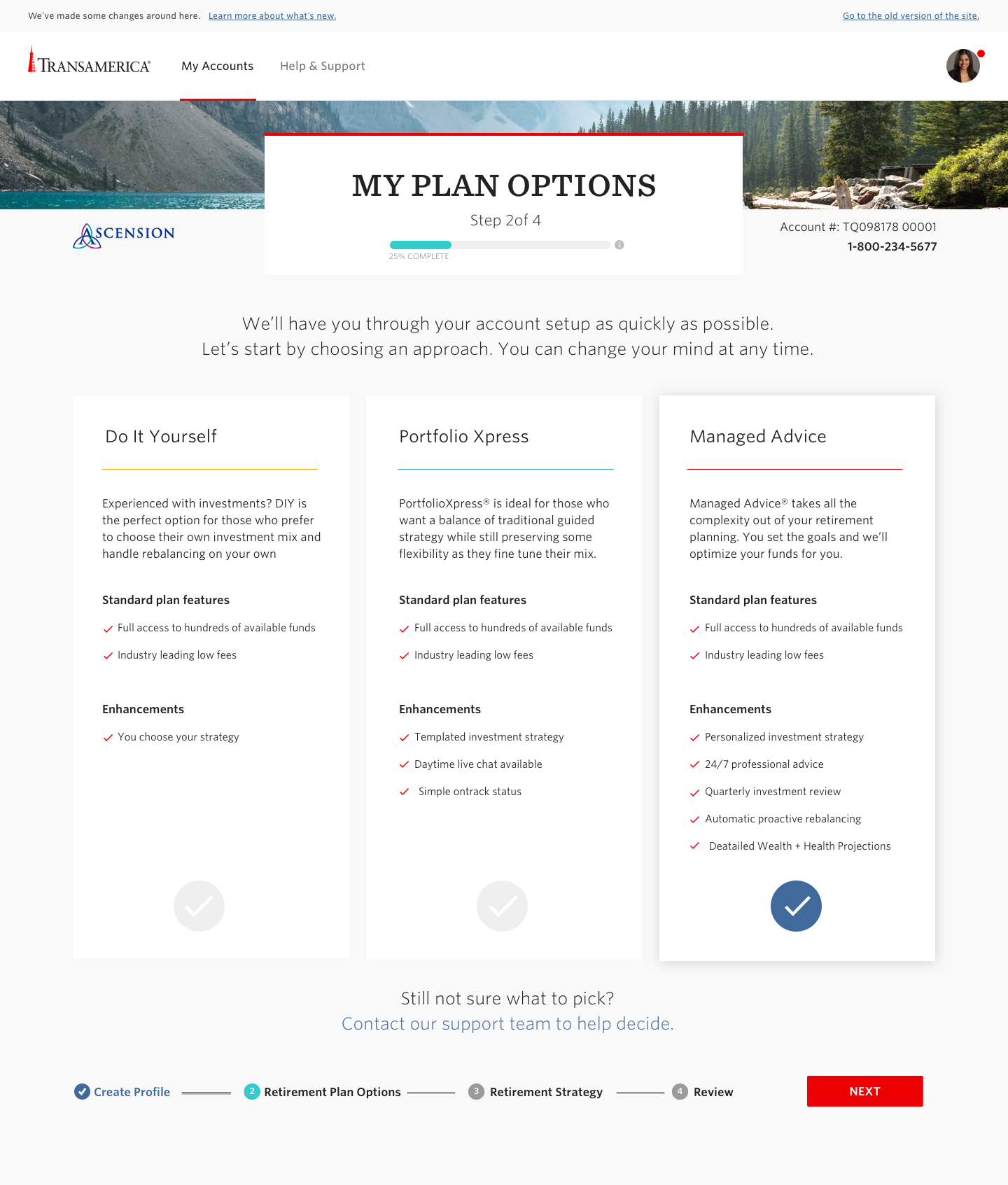
With a green light to proceed and a clear understanding of the goals, I set out to reduce the time it took to bring a new user onboard from 25 minutes to 5 minutes. I mapped the user flow in legacy, identified what was critical to capture up front and what we could punt until after a user was in the system.
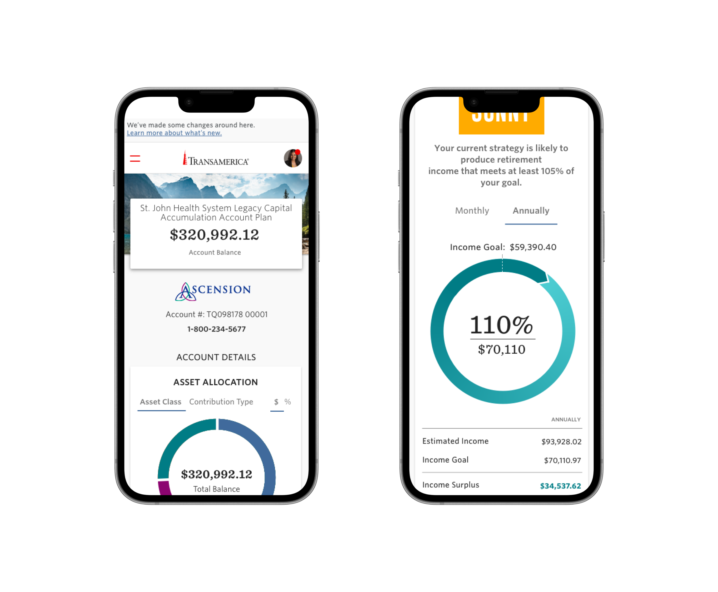
High Fidelity Design
I then began crafting artifacts that could be used in conjunction with our business analysts to flesh out the experience. These included updated flow diagrams, wireframes, and UX copy documents.
Release
I brought the product and development teams along early and often from inception, through the research phase, and in to planning. As we all had a shared understanding of the usage and pain points, we were able to develop our benchmarks and KPIs to establish a collective set of outcomes we were looking to drive through our digital experience. We determined the average cost of support calls, the percentage of failed signups, and determined that there were significant operational savings, retention opportunities, and gains with regard to assets under management associated with improving completion rates by as little as 10%.
Iteration
The onboarding experience was a sizable lift and so we launched incrementally starting with the user registration and security verification steps. We implemented granular event tracking via Google Analytics to monitor detailed usage patterns and followed up with our users. We observed significant improvements in completion as well as some new friction points that were unexpected, particularly as it was ported for use on our mobile app. We prioritized the high value fixes and continued work on the rest of the experience.